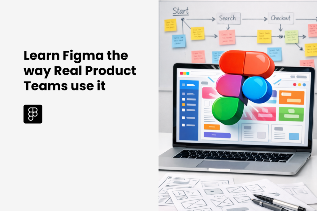
Move beyond the basics to design and prototype a real UI project—using Figma and AI—to confidently apply UI/UX skills in real-world scenarios.

$149.00 Original price was: $149.00.$89.00Current price is: $89.00.

Award-winning UX/UI/ID Designer and Corporate Instructor with 10+ years of industry experience. Led 5+ design teams to create innovative digital products that have impacted millions of users. Designer, Mentor, and educator with extensive design experience across different organizations and academic institutions in the U.S.


Most Figma courses focus on teaching individual tools, how to use the Pen Tool, draw shapes, or replicate screens, but in real product teams, UI/UX design is not about isolated design elements. It’s about creating interfaces that scale, respond, and work seamlessly with developers and across different devices
In this 2-day hands-on Figma UI/UX Design Workshop, participants will learn how professional designers structure files that are responsive, and accessible. By the end of the workshop, you won’t just design screens—you’ll build bulletproof Figma files that reflect how modern products are actually built.
What You’ll Learn:
1. Auto Layout–First Design ThinkingLearn to think in containers, not pixels—the foundation of scalable UI design.
Build responsive components that adapt instantly to different screen sizes
Structure layouts that behave like real code using Auto Layout
Create reusable design systems that scale across devices and products, applying Atomic Design Theory.
2. Visual Hierarchy, Typography & Color Systems
Great design isn’t subjective—it’s systematic. In this module, we go beyond aesthetics and focus on clarity, balance, and accessibility.
Design strong typographic hierarchies that guide user attention.
Build semantic color systems (Primary, Success, Warning, Error) usable across brands, focus on the colors principles.
Apply WCAG accessibility principles to ensure inclusive design.
Learn how to design for edge cases that often break real-world interfaces.
3. Designing for Developers
Professional UI design bridges the gap between design and engineering.
Structure Figma files so developers can implement them without friction and seamlessly.
Create reusable components and layouts that reduce handoff confusion to agile the prototyping and iteration process.
Understand how design decisions impact frontend development.
4. Structural Strategy: Wireframing, IA & Prototyping
Before making things “look good,” great designers make sure they work well.
Learn Information Architecture (IA) fundamentals
Design user flows that align with real user behavior
Move confidently from low-fidelity wireframes to high-fidelity designs
Prototype interactions (micro animations) to validate ideas before visual polish.
Aspiring & Early UX Designers
Career Switchers (Non-Design Backgrounds)
Product, Tech & Startup Professionals
By the end of this workshop, you won’t just receive a certificate—you’ll walk away with:
Live Program
Learn directly from your instructor in a Live classroom and clarify any doubts during the program
Certificate of Completion
To validate your skills and showcase your achievement on LinkedIn and your resume.
Community of Peers
Engage with your peers during and after the program and support each other in your development journey
Live Project
A portfolio-ready UI case study that demonstrates real product-team workflows
$149.00 Original price was: $149.00.$89.00Current price is: $89.00.
CLASS 1: 28 FEB, SAT, USA/Canada 10 AM – 3 PM EST | 7 PM – 12 Noon PST, UK 3 PM – 8 PM GMT, Europe 4 PM – 9 PM CET, Dubai 7 PM – 12 Midnight GST, India 8:30 PM – 1:30 AM IST
1. Foundations and Interface:
Organizing drafts, teams, and projects.
Where to find icons, design systems, and plugins.
Explain the hierarchy. Top-level Frames, Groups, and individual layers. Mention the “Assets” tab for components
Your “Action” zone. Selection tools, Frames, Shapes, Pen tool, Text, and Resources.
The “Frame” Concept.
Mental Model: Explain that Figma is more like HTML/CSS than Photoshop.
2. Precision Design
This section focuses on creating and styling objects with precision.
How to make those shapes look like a real UI.
Typography Essentials
Since your logo relies on bold, clean text, show them how to control it.
3. Responsive Design
The Magic of Auto Layout (Shift + A): Auto Layout is Figma’s most powerful feature. It allows frames to behave like flexbox in web development.
Resizing Behaviors
How does an object react when the frame around it changes?
Fill Container: The element stretches to take up all available space (perfect for responsive text blocks)
Constraints
While Auto Layout handles the inside, Constraints handle how an object sits relative to its parent frame.
Grouping vs. Auto Layout (The “Why”)
Explain the difference to clear up confusion:
CLASS 2: 1 MARCH, SAT, USA/Canada 10 AM – 3 PM EST | 7 PM – 12 Noon PST, UK 3 PM – 8 PM GMT, Europe 4 PM – 9 PM CET, Dubai 7 PM – 12 Midnight GST, India 8:30 PM – 1:30 AM IST
4. The Design System
Reusable Styles (Color & Type)
Instead of picking hex codes every time, students should define “tokens.”
Introduction to Variants
Show how to organize different states of the same element.
The Assets Library
5. Advanced Prototyping
Prototype Mode Basics
Smart Animate
This is the “secret sauce” of professional-looking prototypes.
Overlays & Modals
Teach how to handle temporary UI elements without creating 50 new frames.
Interactive Components
This is where the “Design System” and “Advanced Prototyping” merge.
Component-Level Prototyping: Setting up the interaction inside the main component (e.g., a checkbox that checks itself when clicked).
Yes! While we move quickly into professional workflows, we start with the fundamental “Mental Model” of Figma. If you’ve never opened the app before, our first module will get you up to speed. If you are already a designer, you’ll likely find that you’re finally “un-learning” bad habits.
YouTube is great for learning features (what a button does), but it rarely teaches workflow (how to build a project from start to finish). This course provides a structured path, industry-standard naming conventions, and “insider” logic that you only get from working on real product teams.
No. Everything we teach, including Auto-Layout, or Styles, can be done on Figma’s Free Starter Plan
Absolutely. This course focuses on The Science of UI. We teach you mathematical spacing (8pt grids), type scales, and accessibility standards. Design is a system of logic, not just “vibes.” If you can follow a system, you can design a beautiful interface.
Yes. You won’t just have a few random screens; you will have a documented Case Study including a UI Kit, a responsive landing page, and a high-fidelity prototype that proves you know how to build systems
Yes. Upon finishing all modules and the final project, you’ll receive a certificate you can display on your LinkedIn profile to signal your expertise in Figma Systems.
$149.00 Original price was: $149.00.$89.00Current price is: $89.00.